Quarto Dashboards
This feature is new in Quarto 1.4. Download the latest version of Quarto at the download page
Overview
Quarto Dashboards make it easy to create interactive dashboards using Python, R, Julia, and Observable:
Publish a group of related data visualizations as a dashboard. Use a wide variety of components including Plotly, Leaflet, Jupyter Widgets, htmlwidgets; static graphics (Matplotlib, Seaborn, ggplot2, etc.); tabular data; value boxes; and text annotations.
Flexible and easy to specify row and column-based Layouts. Components are intelligently re-sized to fill the browser and adapted for display on mobile devices.
Author using any notebook editor (JupyterLab, etc.) or in plain text markdown with any text editor (VS Code, RStudio, Neovim, etc.)
Dashboards can be deployed as static web pages (no special server required) or you can optionally integrate a backend Shiny Server for enhanced interactivity.
Examples
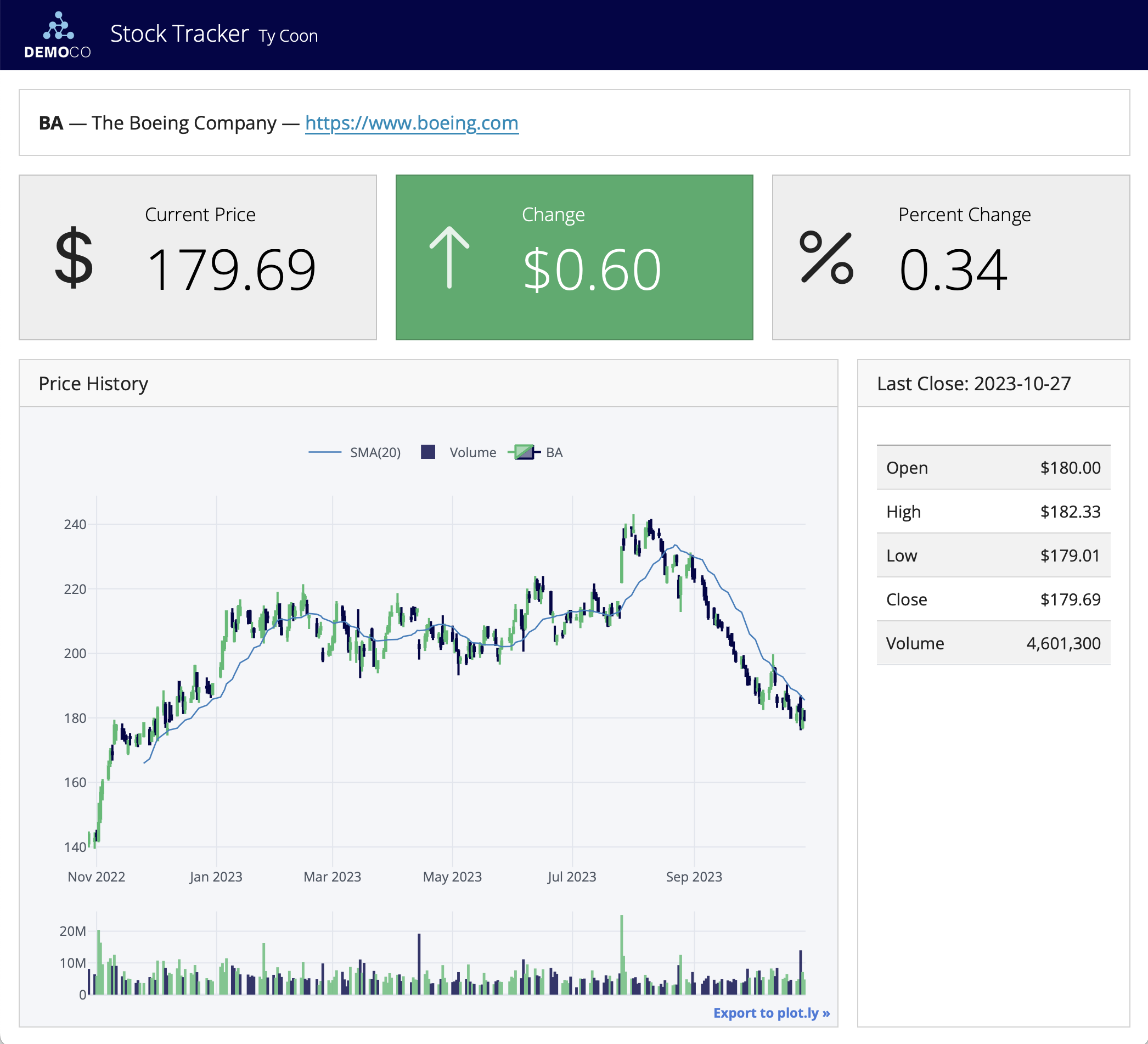
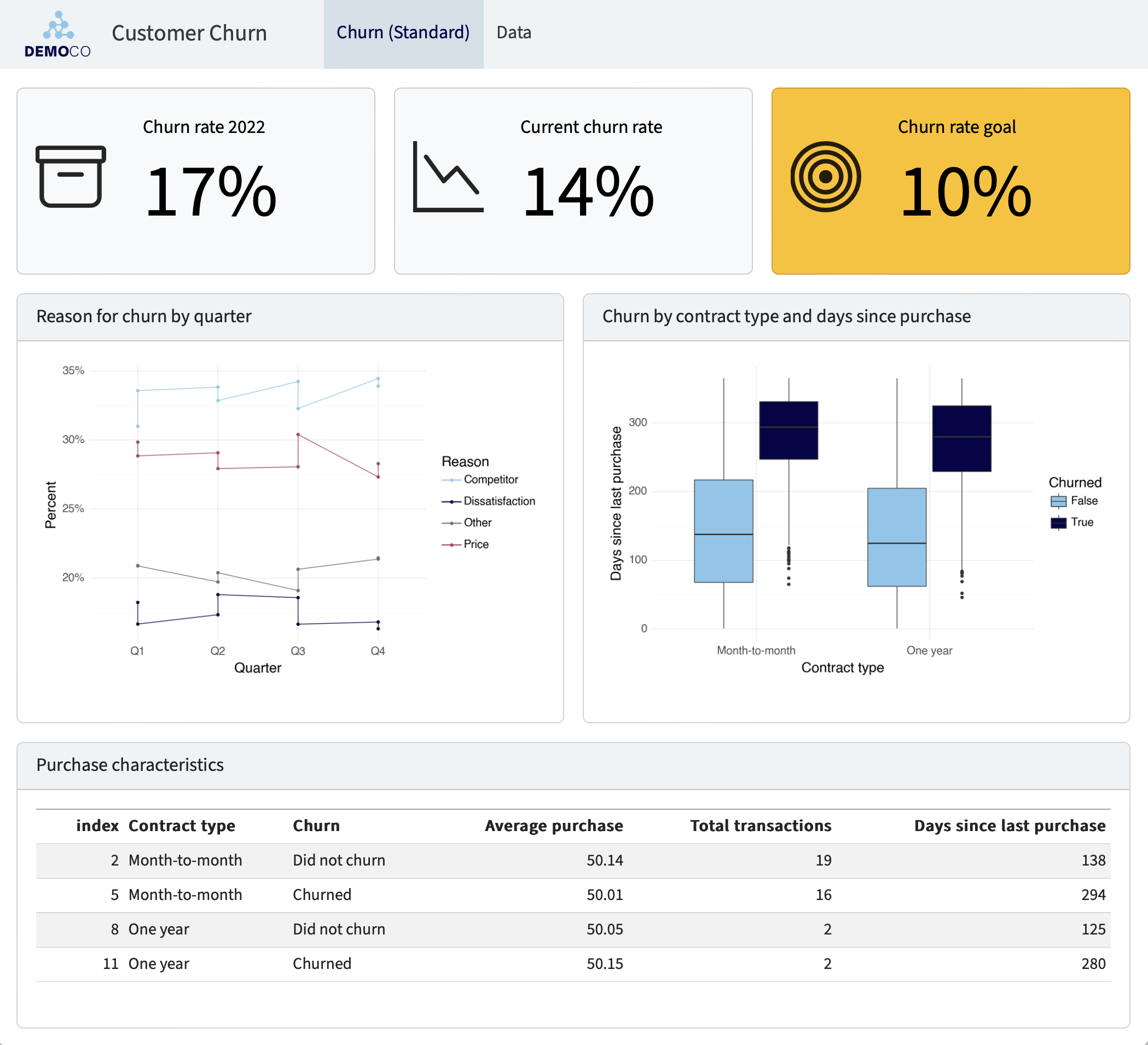
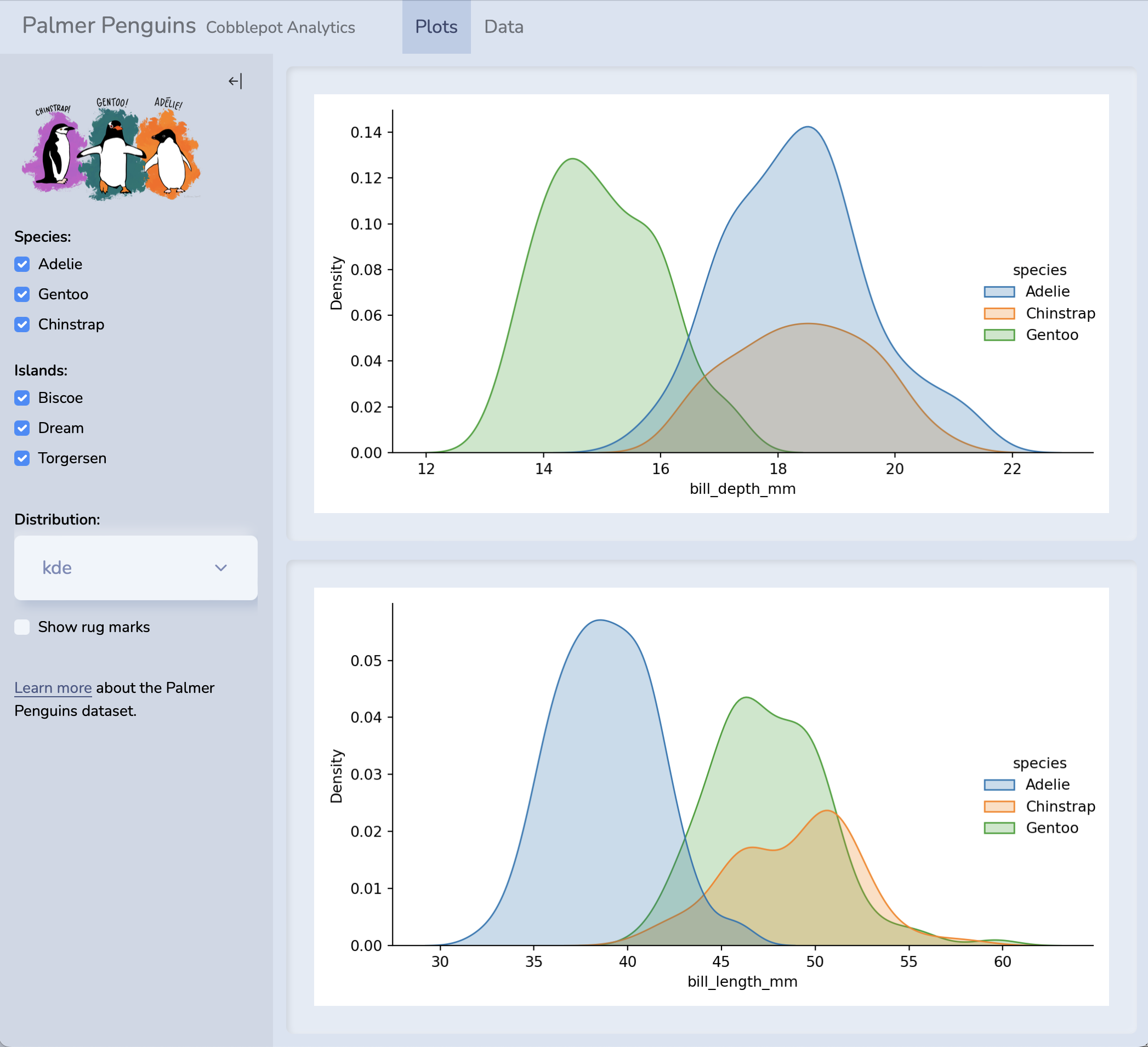
You can create highly customized layouts and use a wide variety of dashboard themes as illustrated in these examples (click to see them in more detail):
For live versions of these dashboards, source code, and additional examples see the dashboard section of the gallery.
Walkthrough
Here we’ll walk through a simple example to illustrate the basics. Then, we’ll provide detailed instructions on how to get started with building your own dashboards.
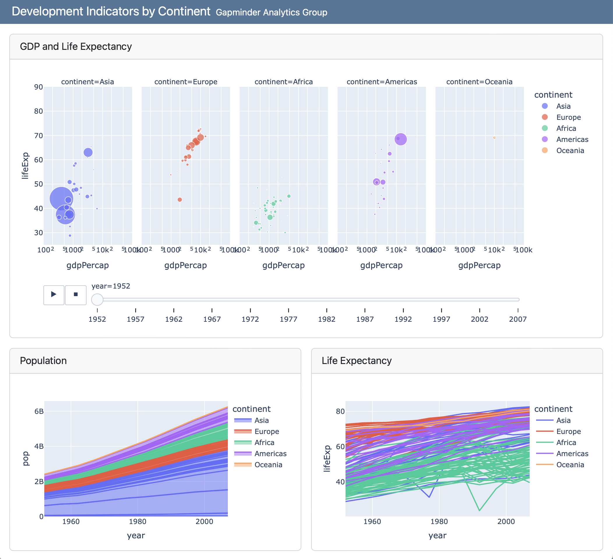
This simple single-page Python dashboard uses interactive Plotly visualizations to explore development indicators in the Gapminder dataset. The dashboard includes two rows, the second of which includes two columns:
Dashboards consist of several components:
Navigation Bar — Icon, title, and author along with links to sub-pages (if more than one page is defined).
Pages, Rows, Columns, and Tabsets — Pages, rows and columns are defined using markdown headings (with optional attributes to control height, width, etc.). Tabsets can be used to further divide content within a row or column.
Cards, Sidebars, and Toolbars — Cards are containers for plots, data display, and free form content. The content of cards typically maps to cells in your notebook or source document. Sidebars and toolbars are used to present inputs within interactive dashboards.
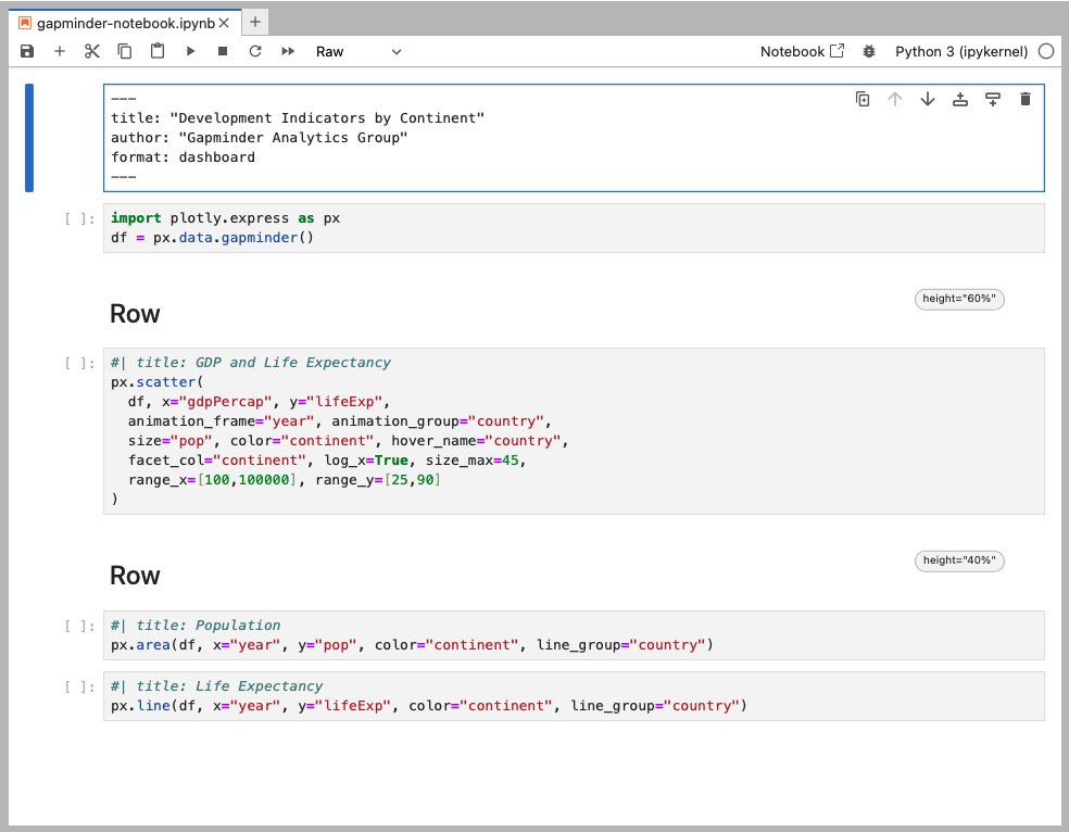
Dashboards can be created either using Jupyter notebooks (.ipynb) or using plain text markdown (.qmd). Here is the code for the notebook version of the above example (click the image for a zoomed view):
Here is the plain text .qmd version of the dashboard (click on the numbers on the far right for additional explanation of syntax and mechanics):
---
title: "Development Indicators by Continent"
author: "Gapminder Analytics Group"
format: dashboard
---
```{python}
import plotly.express as px
df = px.data.gapminder()
```
## Row {height=60%}
```{python}
#| title: GDP and Life Expectancy
px.scatter(
df, x="gdpPercap", y="lifeExp",
animation_frame="year", animation_group="country",
size="pop", color="continent", hover_name="country",
facet_col="continent", log_x=True, size_max=45,
range_x=[100,100000], range_y=[25,90]
)
```
## Row {height=40%}
```{python}
#| title: Population
px.area(
df, x="year", y="pop",
color="continent", line_group="country"
)
```
```{python}
#| title: Life Expectancy
px.line(
df, x="year", y="lifeExp",
color="continent", line_group="country"
)
```- 1
-
The document options define the
titleandauthorfor the navigation bar as well as specifying the use of thedashboardformat. - 2
-
Rows and columns are defined using headings. In this example we define two rows and specify their relative sizes using the
heightoption. - 3
-
Computational cells become cards that live within rows or columns. Cards can have an optional title (which here we specify using the
titleoption). - 4
- The second row includes two computational cells, which are automatically split into two side by side cards.
Getting Started
Step 1: Install Quarto
Dashboards are a feature in the Quarto v1.4. Before you get started, make sure you install the latest release version of Quarto.
| Platform | Download | Size | SHA-256 |
|---|---|---|---|
| Ubuntu 18+/Debian 10+ | quarto-1.5.54-linux-amd64.deb | 119.21 MB | ce7be60 |
| Linux x86 Tarball | quarto-1.5.54-linux-amd64.tar.gz | 120.54 MB | 424a8c5 |
| Linux Arm64 | quarto-1.5.54-linux-arm64.deb | 122.87 MB | 85464fd |
| Linux Arm64 Tarball | quarto-1.5.54-linux-arm64.tar.gz | 124.02 MB | d23bf62 |
| RHEL 7 Tarball | quarto-1.5.54-linux-rhel7-amd64.tar.gz | 123.02 MB | af63d5b |
| Mac OS | quarto-1.5.54-macos.pkg | 196.79 MB | 1ad00eb |
| Windows | quarto-1.5.54-win.msi | 113.67 MB | 8198309 |
| Release notes and more downloads… |
You can find release notes and installers for all platforms in the download page.
Step 2: Learn the Basics
Start by learning how to lay out your dashboard and populate it with content:
Dashboard Layout shows you how to control the navigation bar, and how to arrange your content across pages, rows, columns, tabsets, and cards.
Data Display shows you how to display data in your dashboard as plots, tables, value boxes, and text.
Step 3: Explore Further
Once you’ve mastered the basics, check out these additional articles to learn more.
Examples provides a gallery of example dashboards you can use as inspiration for your own.
Inputs demonstrates various ways to layout inputs for interactive dashboards (sidebars, toolbars, attaching inputs directly to cards, etc.)
Theming describes the various way to customize the fonts, colors, layout and other aspects of dashboard appearance.
Parameters explains how to create dashboard variants by defining parameters and providing distinct values for them on the command line.
Deployment covers how to deploy both static dashboards (which require only a web host, but not a server) and Shiny dashboards (which require a Shiny Server).
Interactivity explores the various ways to create interactive dashboards that enable more flexible data exploration.
